Project Description
Designing Classroom Posters
As a teacher, being a designer has its own set of perks. Designing classroom posters is one of those fun aspects of being a designer and an instructor. Not only does it allow you to showcase your creativity, but it also helps you create a visually stimulating and engaging environment for your students.
Designing your posters gives you complete control over the final product’s message, color scheme, and design elements. You can highlight a concept or idea you feel is essential for your students to remember. You can also select a color scheme consistent with your classroom’s theme or subject. This way, your posters will be visually appealing and serve as a helpful tool for your students to retain information.
Another advantage of designing your posters is the ability to customize them to fit your unique teaching style. You can incorporate humor, quotes, or graphics that resonate with your students and make learning more enjoyable. You can also tailor the posters to different age groups or learning levels, making them more effective in conveying the intended message.
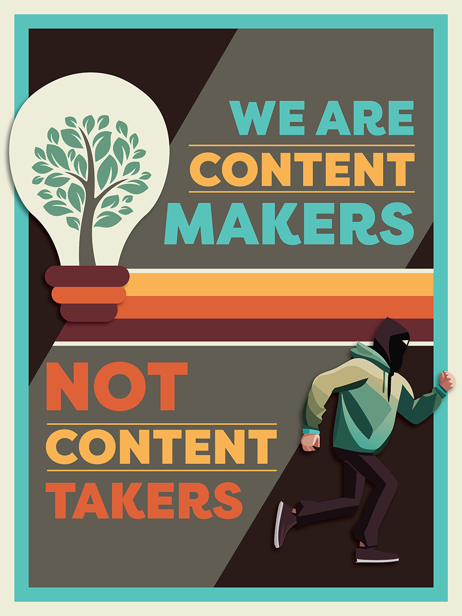
We are Content Makers
This poster was designed to encourage students to make their artwork instead of tracing over existing images. This is also one of the first posters I used artificial intelligence to generate vector artwork in Adobe Illustrator. The “thief” was generated by Adobe Firefly. Sources: Envato Birthday Bundle, Adobe Stock, Adobe Firefly

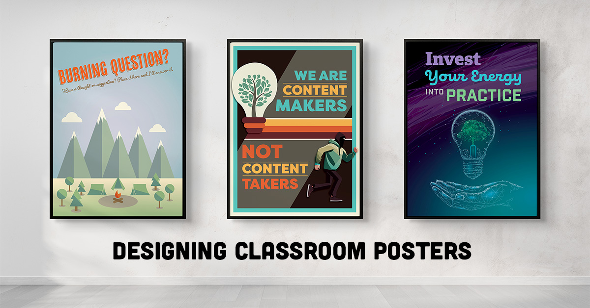
Invest Your Energy
This poster resulted from my frustration with how students consume social media in the classroom. I often see students “doom scrolling” through videos of artists doing their work. And I always comment on how this is their time to invest their energy into practice. Make some, break it, then make it better! Sources: Adobe Stock, Adobe Firefly

Burning Question?
This poster was designed to create a space for students to place sticky notes if they have questions. This technique benefits students who may need to be more open to speaking up in group settings. Place the poster near the exit and keep a pad of sticky notes nearby. You never know what messages they may leave you. Sources: Envato Birthday Bundle
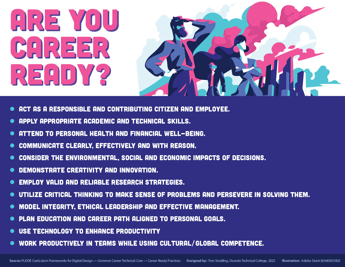
Are You Career-Ready?
This poster was designed to highlight the twelve “Career Ready Practices” in the state-supplied curriculum for Digital Design. I chose a bold color scheme to grab the students’ attention and keep them focused on the dynamic future ahead. Sources: Adobe Stock
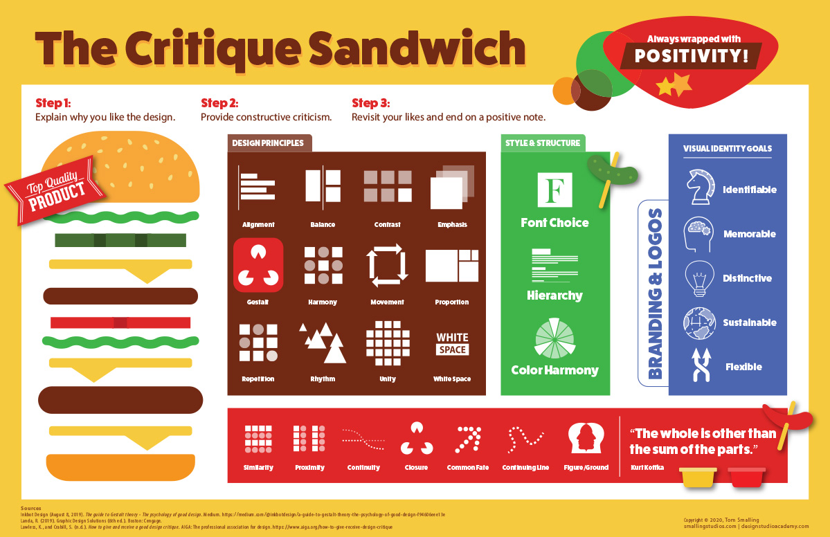
The Critique Sandwich
This poster was designed to complement a critique session with the students. I reimagined the adage of a sh-t sandwich to explain how critiques should happen. The “meat” of the sandwich is the use of design principles, with the condiments of the font and colors all wrapped between two buns of positivity. Sources: Adobe Stock
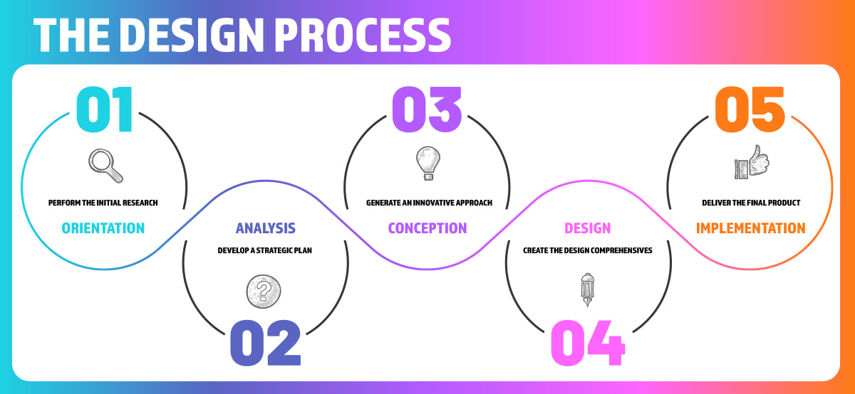
The Design Process
This poster was designed to communicate the Design Process to students. We use the five-phase design model in the classroom on many of our projects. I’ve also used the individual elements on assignments to give the students a visual reference on the phase of design they are currently working within. Sources: Adobe Stock
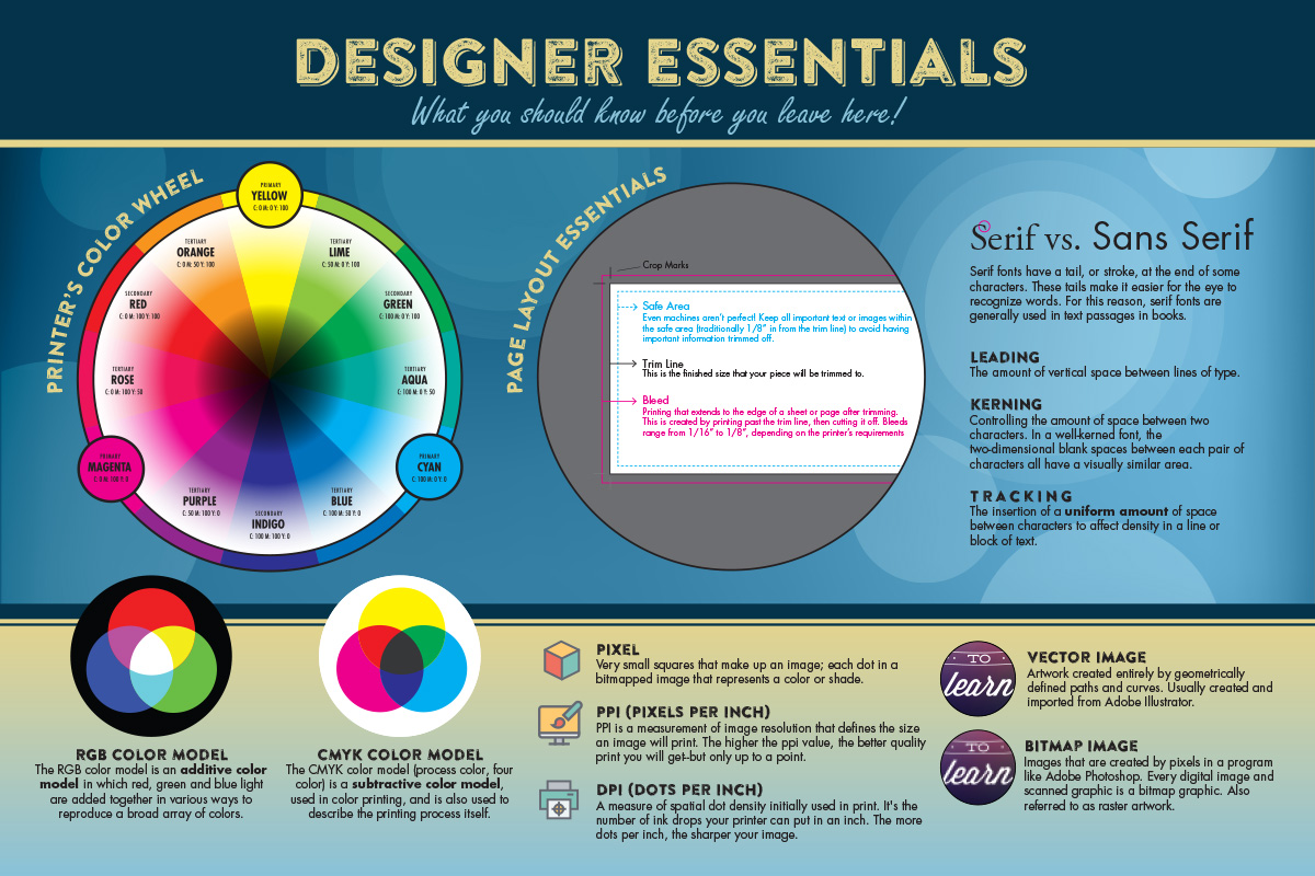
Designer Essentials
The Designer Essentials poster was generated as a reference for the students. It covers the essential content the students should understand after the fundamentals portion of the course. I often reference this poster when speaking to students. Sources: Adobe Stock | 36 Designer Flat Line Icons from Designer Daily, licensed under CC BY 3.0 DEED.
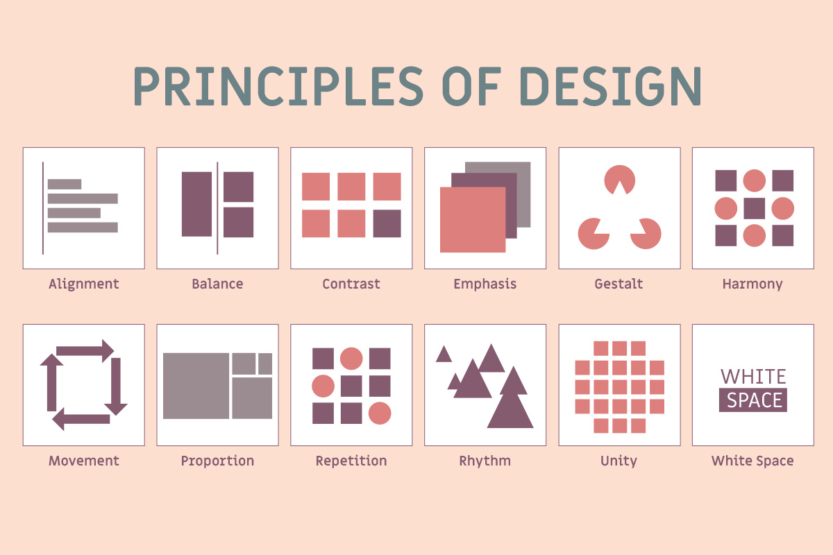
The Principles of Design
This poster is an excellent resource in the classroom. I often ask students to reflect on what principles are evidenced in their work and what they can work on adding to a piece. Having a well-designed reference poster allows the student to understand the concepts.
